
After the previous chapters of a coffee with IoT, Chapter 0: A recipe for internal hacktivism, Chapter 1: NiFi flows and Chapter 2: The raw data, today we will talk about Chapter 3: Seeing all the data in a graph.
Communiqué from the hacktivists addicted to condensed milk
Are you worried about cameras and microphones?
The Big Brother who is waiting for us, and who is already being built, is not the one from 1984. We are not going to have vigilantes putting their understanding capacity into the interpretation of images and sounds. Nor are we going tohave censors who read our texts carefully. We will not be denounced by our children for speaking out against the government at dinner. There will be no Nordic Fire Eye or Ear.
The control that awaits us will not be that. Or, at least, it won't be just that.
We will bemonitoring in streaming the electricity consumption, the data use in the mobile phone (or in the wearabledevice we carry), the heart rate, the blood pressure and the blood oxygen saturation index... We will be analyzing data that, without carrying meaning by itself, turn out to be highly significant.
A not-so-ugly graph
I am sure that after the previous articles in the series we are all impatient to see all the facts once and for all. Well... not so fast.
Perhaps the best way to view a data set is to plot it on a graph. In our case, we could represent on the horizontal axis the passage of time, and on the vertical axis the value of the power consumed. In this way, if, for example, we wanted to represent 2 seconds (which is the interval between one measurement and another from our intelligent plug) in one millimetre of the X axis, we would have to be prepared to have a graph of just over 5 kilometres (5,327.581 metres). This leads us to think that visualizing all the data at once is not going to be easy, nice or readable.
Still, if only to satisfy our curiosity, let's see what happens if we try to put all the data into a graph of this type:
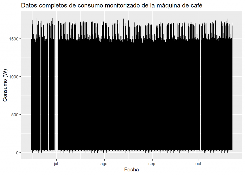
Of course, this is a very ugly graph, but we can get some information out of it. Do you dare to interpret the graph to see what information you get out of it before you read on? :
- The graph is practically a monolithic black block that ranges from a value slightly above 0 to 1500W.
- There are gaps in the black block, corresponding to periods of absence of data (late June, early July and early October).
- A series of small peaks appear at the bottom which should be studied in more detail.
- In contrast, at the top of the graph, we see combs usually composed of groups of 5 peaks that are usually followed by a pair of much lower peaks. Although we don't know their meaning (although we can already sense something), a series of these characteristics (5+2, 5+2, 5+2...) clearly represents weekly periods, with 5 working days and 2 of the weekend.
- Paying a little attention, we can see that in mid-August what corresponds to the holiday of the 15th, fell on a Wednesday.
- If we pay more attention, we can observe a "long weekend" in the second week of October, since that Friday was also a holiday.
- After that October gap, we find a week in which it seems that there are 6 working days and only one holiday. And once again, this is a meaningful fact, since that week a datathon was held at FutureSpace, and participants were allowed to use the office during the weekend (although, apparently, they only attended on Saturday).
Dating
In a somewhat informal way, we can classify the data we generate about ourselves into these three categories:
- Declared data : Are those that you have directly and explicitly exposed. For example, when you open a bank account you provide your name, address, identification document...
- Observed data: This is data that can be known about you, without you consciously sharing or generating it. For example, a bank knows where, when and in what amount you withdraw money from your account or make a purchase with a card.
- Inferred data: Are obtained from the study of the previous data (observed and/or declared). For example, the bank may study your spending patterns and classify you in a risk group in order to determine your creditworthiness to repay a loan.
Are you one of those who leaves a light on in the house when there's no one around to make burglars think there are people inside? It may seem like a simple idea, but we probably think it's worse to put a sign in the window saying: "There are two people inside the house right now".
It seems that we tend to believe that thieves trust observed data more than declared data. In other words, data that a person explicitly and expressly shares seems less "reliable" than data that, from the outside, is obtained about the person. We can even get to the point of believing more in observed and inferred data, and in the results of the algorithms and analytical methods applied to them, than in what a person expressly states. So, we will be talking about dataism.
He was the cultural analyst David Brooks, who in the article "The Philosophy of Data" (New York Times, 2013), first used the term dataism. Since then, other thinkers have appropriated it, and have extended it to become an ideology, a philosophy, or even a new religion.
Most likely you'll find this all extreme, cold, or even stupid, but who do you trust? The word of the defendant or the polygraph test? The word of the defendant or the DNA test? The word of the defendant or the fingerprint identification? Who do you trust?
Significant data
Surely some more appreciation can be made, but it's not bad for a quick look at a graph representing over 5 million pieces of data.
It is interesting to see the ease with which we understand and treat visual data, especially in comparison with the poor ability to understand the same data when it is presented in writing. At no time would I have been able to present the data in its entirety in a text format. A table with such a number of records would be unreadable, and none of us would be able to assimilate much by reading it. However, we have been able to present and begin to visually understand that same volume of data.
Humans (though not only humans) are very good at finding visual patterns, while a computer, at present, finds it impossible to give a developed interpretation of a somewhat complex graph using machine vision techniques. Perhaps, it was relatively easy to get a computer to learn to detect changes in the slope of a line or proportions in a pie chart. But even if we could, in my opinion, it would be the wrong approach.
I believe that Turing was right in stating that what is important is that an artificial intelligence looks like a human intelligence, because the way in which these intelligences are constructed does not have to be, and in fact they are not, the same.
A computer is best served by a board.
But what interests me most in this whole affair is the fact that we are able to know which days an office is used by paying just a little attention to an embarrassing graph resulting from a prank. We are not in the presence of children who listen to their parents' conversations to inform the political police. We are dealing with an intelligent plug that registers electrical consumption. The interesting thing is that we can extract some semantics from data that are completely lacking in it.
What else can we know about the registered electricity consumption of the coffee machine?
We will see this in the following deliveries of IOT coffee