
What is data visualization?
We could define data visualization as the set of techniques that allow us to transform data into visual elements that lead to understanding the underlying information in the data. In this way we can detect trends, outliers or patterns at a glance and without having to see the entire data.
It is well known that the world of data is in full swing. We are part of a paradigm shift in which data has gone from being scarce and expensive to cheap and abundant. In this sense, visualization plays a fundamental role as it has become an easy and fast way to extract value from data without the need to make use of Machine Learning techniques.
Importance of visualization
Sometimes it can be difficult to explain how important data visualization can be, so let's take a look at some examples.
Same statistics, different graph
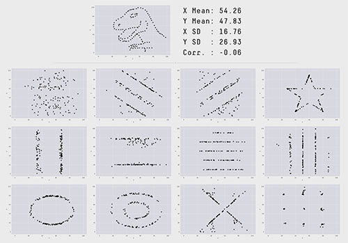
Perhaps the most famous case, and no less curious for that reason, is that of Datasaurus. This is an example in which several sets of data that are, a priori, equal are displayed. These sets even have the same mean, standard deviation and correlation. Once we represent them we see that they are far from being similar, a conclusion that we would never have reached if we had stayed only with the basic statistics.
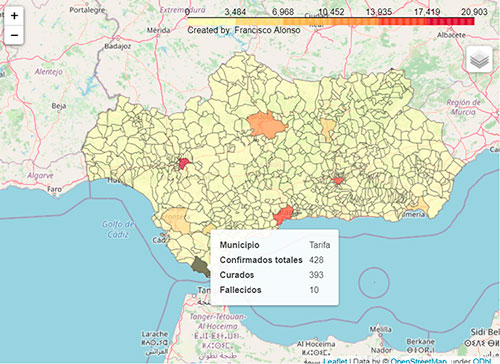
Coropletas, all the information at a glance
In this day and age, someone might be interested in the Covid-19 cases in Andalusian municipalities. It could be tedious to consult the number of infected people for each of the 786 municipalities. On the other hand, by means of a cartographic viewer we can, at a glance, get an idea of the situation in the whole community, and we can even make the map interactive.
In this sense, in the series of articles Coffee with IOT of our blog we can see another clear example related to the coffee consumption of employees.
Graph time series to identify trends
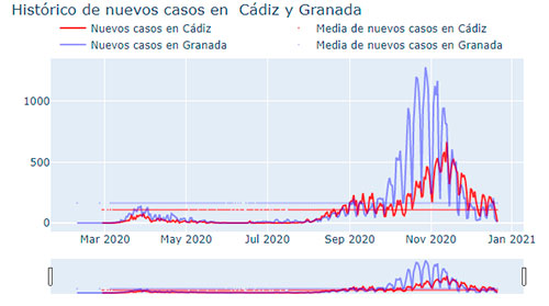
In the same way, we could be interested in checking the months in which the virus has had the greatest impact, and at the same time see the comparison for two provinces. This study by looking at the raw data would be slow and complicated. However, in the following graph we can access all this information in a quick and understandable way.
Data visualization malpractice
It seems clear that data visualization is a very powerful tool for understanding data, but as they say: with great power comes great responsibility. It is a tool as useful as it is dangerous because, in many cases, deliberately or not, visualizations are linked to a manipulation of information. In addition, due to the tremendous activity that exists today in social networks, this can lead to hoaxes, misinformation, and a long list of controversies.
It is not difficult to find examples of misleading visualizations on the net. We are going to discuss some of them below.
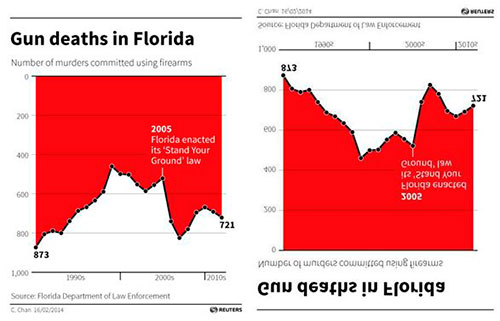
Inverted shafts
Inverting any of the axes of the graph is an action that, if we are not careful, can be very misleading in certain contexts. Here we discuss one of the most famous examples.
In 2005 the state of Florida passed the "Stand Your Ground" law. This law, in a nutshell, allows citizens to use guns for self-defense in certain circumstances. As we can see, in the graph issued by the legal department of that state, it is about representing the evolution of murders by firearms before and after the passage of that law. Someone who does not notice the detail of the inversion of the ordinate axis might think that deaths have gone down since the law was passed. However, if we return the axis to its natural position, we realize that the trend is far from decreasing.
Simplicity and readability
Sometimes, when developing a graphic we tend to think that it should be impressive and eye-catching. However, in most cases a simple and legible graphic can convey the same or even more information. And, as we can see in this example, if we are obstinate in our efforts to make an eye-catching chart, we can be guilty of making the chart fail to meet its main objective, the understanding of the data.
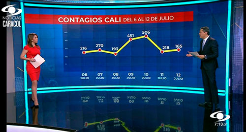
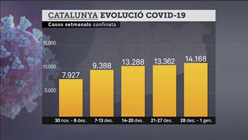
Representations not true to scale
As we see in the two examples, a representation of the data that does not fit the scale can be misleading.
In the first graph the first two bars look normal. On the other hand, the last three should be much closer to 15,000 than to 10,000. This makes the rise in the number of cases seem less abrupt.
Something similar happens in the second example, we can observe that for example, 218 is located below 165, giving the sensation that the cases are increasing.
Tips for a good visualization
To try to avoid this type of manipulation, here are some visualization tips:
- Creativity is a degree in data visualization, we have to find ways to give new dimensions to the graph. To do this you can use colors, shapes, sizes...
- Be clear about your target audience. For example, logarithmic scales are useful, but not everyone understands them.
- A legend is always conducive to understanding.
- The same goes for colors. In this sense it is convenient to: use color palettes friendly to the eye, that colors are associated with the data with some consistency (for example we are very used to associate red to negative and green to positive)...
- Numerous studies support the fact that human beings are very bad at distinguishing angles. That's why a bar chart will always be better than a pie chart.
- Be clear about the objective. We can find numerous schemes that lead us to the best representation in each case as we see below:
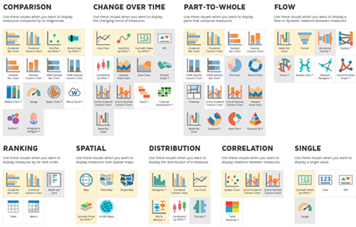
Taking into account the points discussed here will simplify the process of designing infographics that are really useful for the audience.
In conclusion, a good visualization should communicate a set of data clearly and effectively. That said, quoting the precursor of one of the most used graphics today, such as box plots, seems to me a great way to close this article. As John Tukey said: "The greatest value of a picture is when it forces us to notice what we never expected to see".